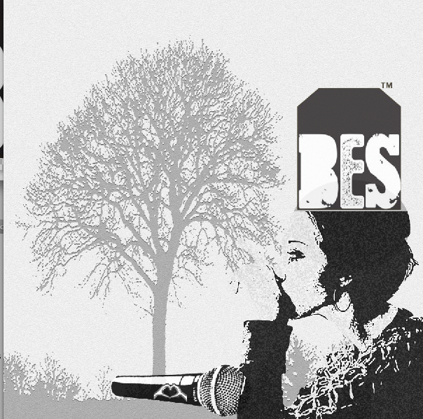
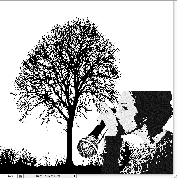
I finally finished my compositions in the album cover. I have changed some opacities and fills to create emphasis on the black woman to bring her forward. The cloudy and grey color background with a tree represents the memories of the woman. This perfectly fits with the song title 'My Story' as singing stories of oneself is also reflecting on one's past. Now I need to choose font for the title and the artists' name.
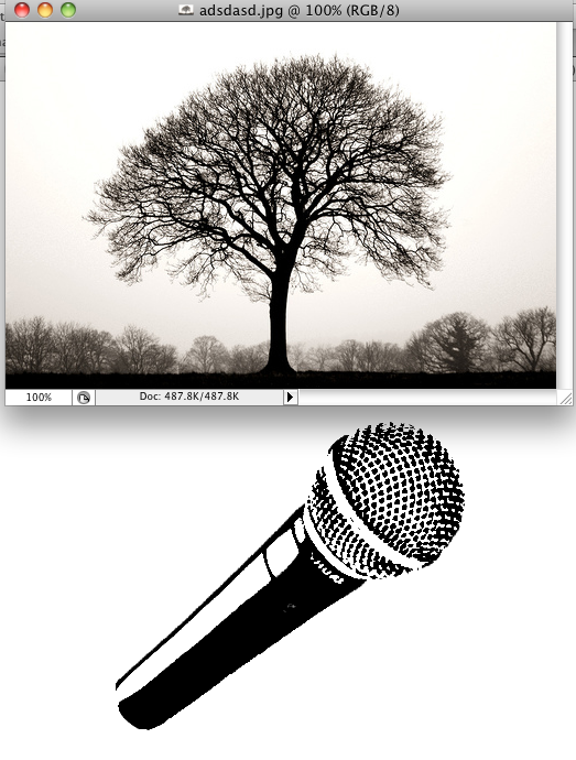
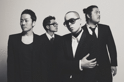
I have chosen a black woman for the cover as Brown Eyed Soul are a RnB group and value black soul music. The tree in the background represent the collection of people's memory that Brown Eyed Soul communicates by singing.
In order to fit my song 'My story' by Brown Eyed Soul, I collected images from the magazines that portray people's life and personal stories. The genre of Brown Eyed Soul is R&B that they have been using Africans as their covers for their 2nd and other special albums. Hence, I was attracted by pictures that contained black people around the world. The images are effectively highlighting their hardships which will be reflected as their 'story' in my design.
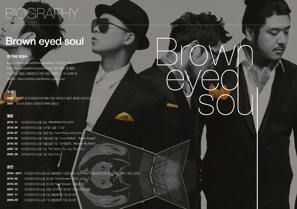
The website of Brown Eyed Soul is consist of relatively dark and mostly grayish color scheme. The mood of the website is almost placid but, the clothes they are wearing remind of funeral, which probably emphasize their name 'Soul'. The font is simple but has addition of extending lines etc.
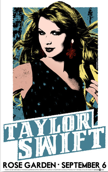
First few ideas of my music cover. Since my Artist band is going to be Brown Eyed Soul, i chose posters that contain people.
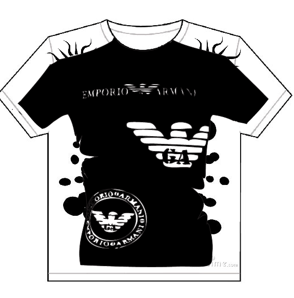
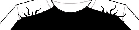
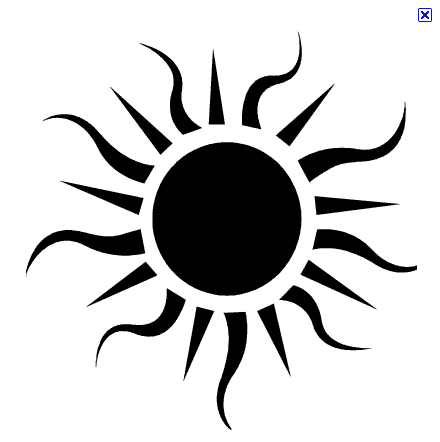
The general concept of my fourth Teeshirt design is to including a t-shirt within a t shirt. It was pretty difficult to adjust the size my design T-shirt(black) because I had to match the shape of the basic T-shirt. I added more designs on the outside to give more detail. The sun set logo at the back effectively brings my t-shirt design forward and provide emphasis. I purposely used wrinkle tool on the waist part to make the black dot logo to look like blood. Overall, it was not difficult to think about the design but the process was challenging.
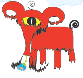
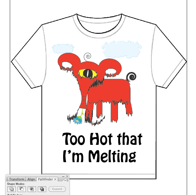
For my third T-Shirt Design, I have created a red elephant. This was a funny project because I originally wanted to create a hamster character, but it turned out to be a elephant. This design was almost a experimental work, since I was using all the tools that i never used before such as twirl tool and wrinkle tool etc. In the beginning however, i tried to follow the tutorial but I began to mass up some parts. I am still happy to see this design :)
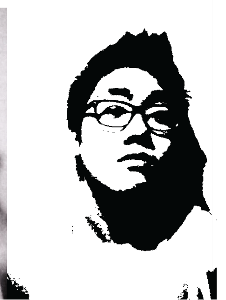
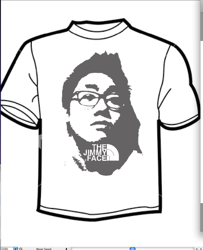
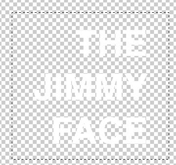
I really like this project because I have thresholded a photo of my face and put it onto the t shirt. The process of putting the image was not that difficult because i only used threshold and changed the opacity. However, it was a little difficult to create my own logo of 'The North Face'. I had to find out what logo the brand used and actually had to crop out some symbols that is included in the original image. I was able to manage my images and created similar logo style. On top of my threshhold face, I put THE JIMMY FACE so that i can borrow the logo style of THE NORTH FACE. It was extremely difficult to adjust the size and the gaps between the words. But after number of tries in photoshop, I was able to get the right size. This is one of my favorite T-shirt design.
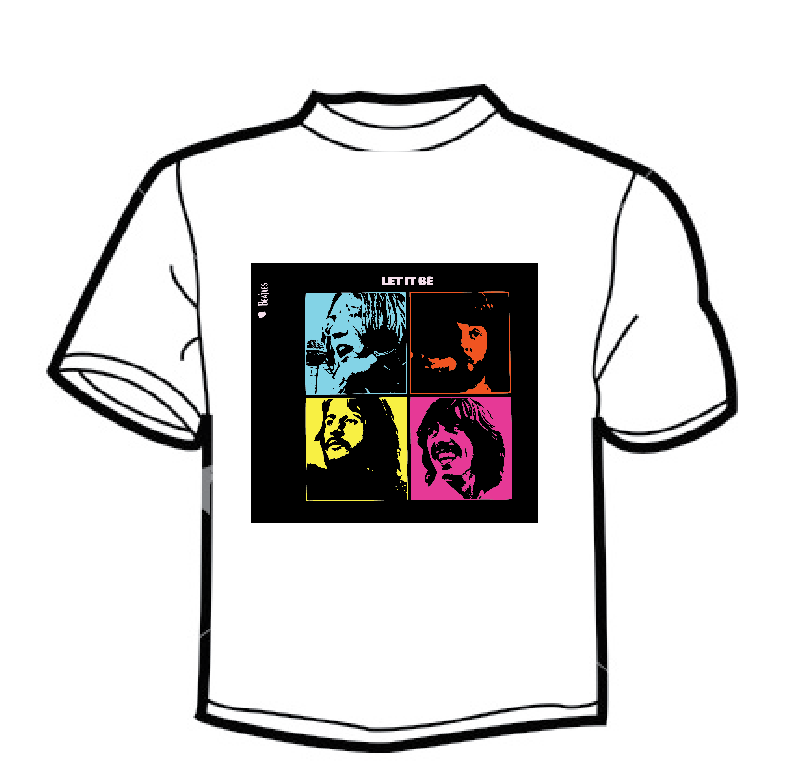
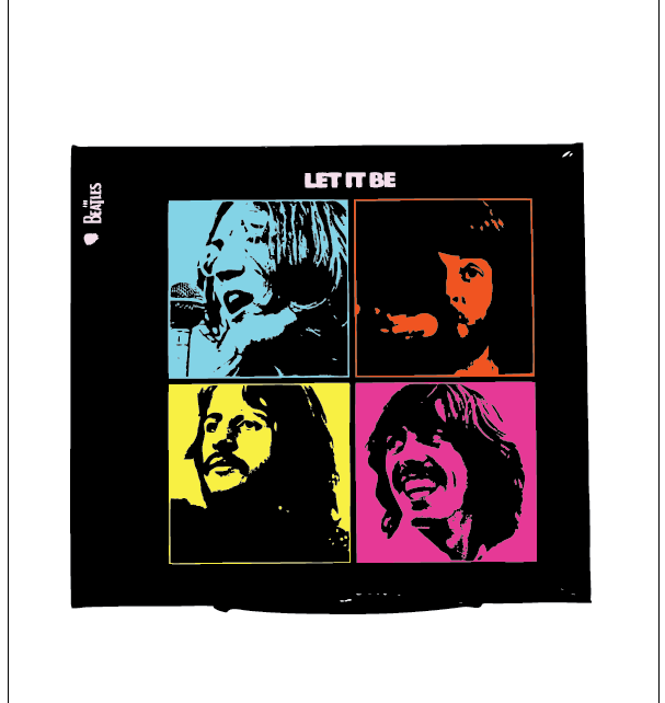
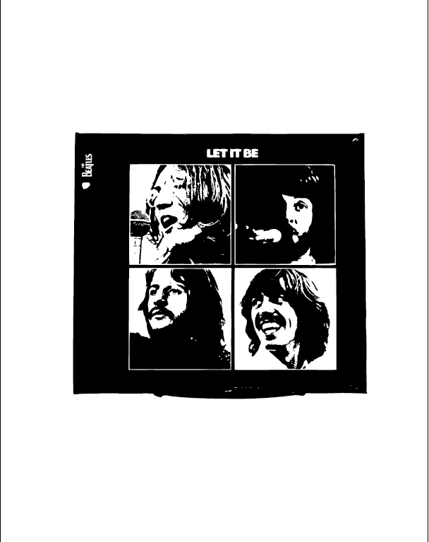
One of my favorite singers- BEATLES.
I have used their 1970 'Let it Be' album cover for my first T-Shirt Design :). I placed the image in the center as many T shirts these days use this way of printing. I tired to combine Andy Warhole's style also in the printing in order to include bright color schemes. The process of filling colors up was very difficult as i had to fill up each individual white space since the section is divided into 4 separate squares..